library(tidyverse)
library(palmerpenguins)Basic ggplot2 Example
MEDS
data visualization
A short tutorial on how to use ggplot2 to visualize data.
A basic scatter plot
example_plot <- ggplot(data = penguins,
                       aes(x = bill_depth_mm,
                           y = bill_length_mm)) +
  geom_point()

example_plot
Warning: Removed 2 rows containing missing values (geom_point).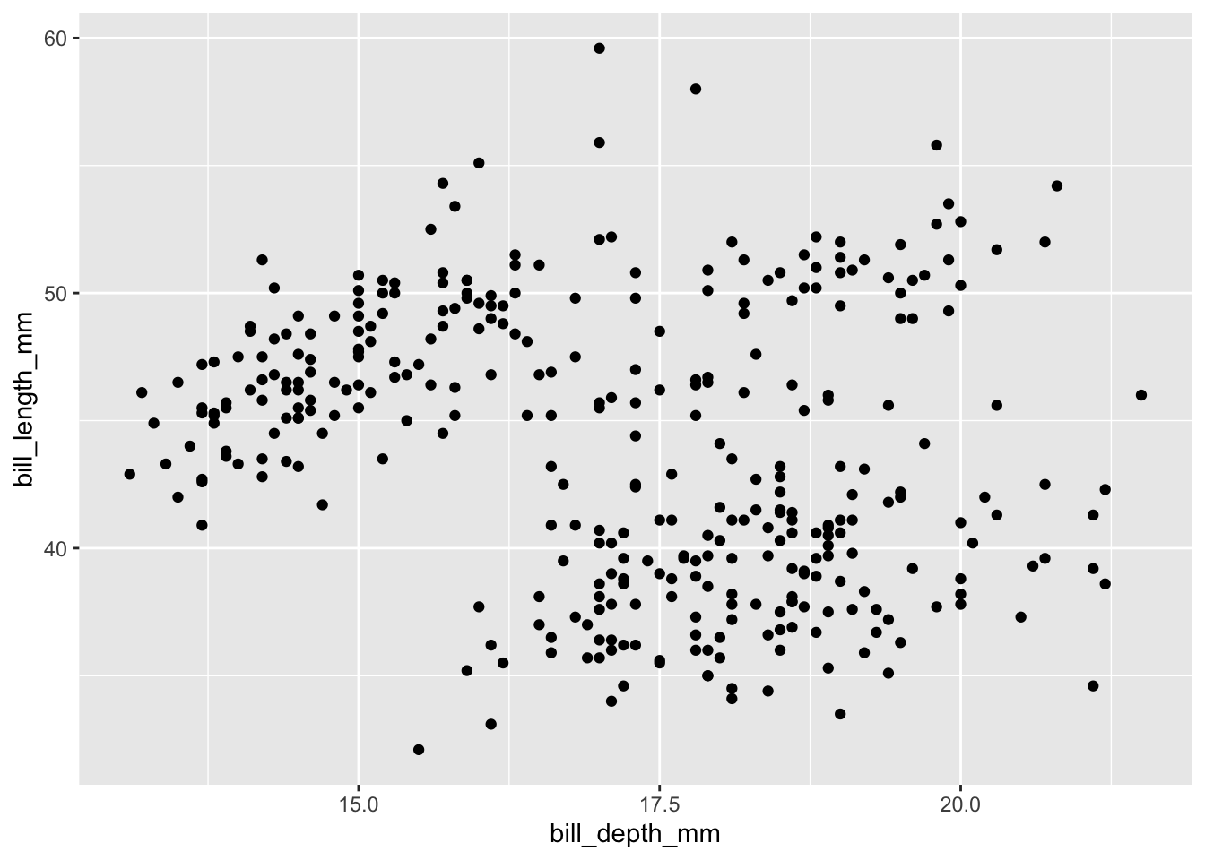
Lets spice this up a bit by having each penguin species show up as a different color and adding a theme.
Mapping aesthetics
reminder: when changing something on the graph based on a variable, like point color below, it needs to go inside the function aes().
example_plot <- ggplot(data = penguins,
                       aes(x = bill_depth_mm,
                           y = bill_length_mm)) +
  geom_point(aes(color = species)) +
  theme_light()

example_plot
Warning: Removed 2 rows containing missing values (geom_point).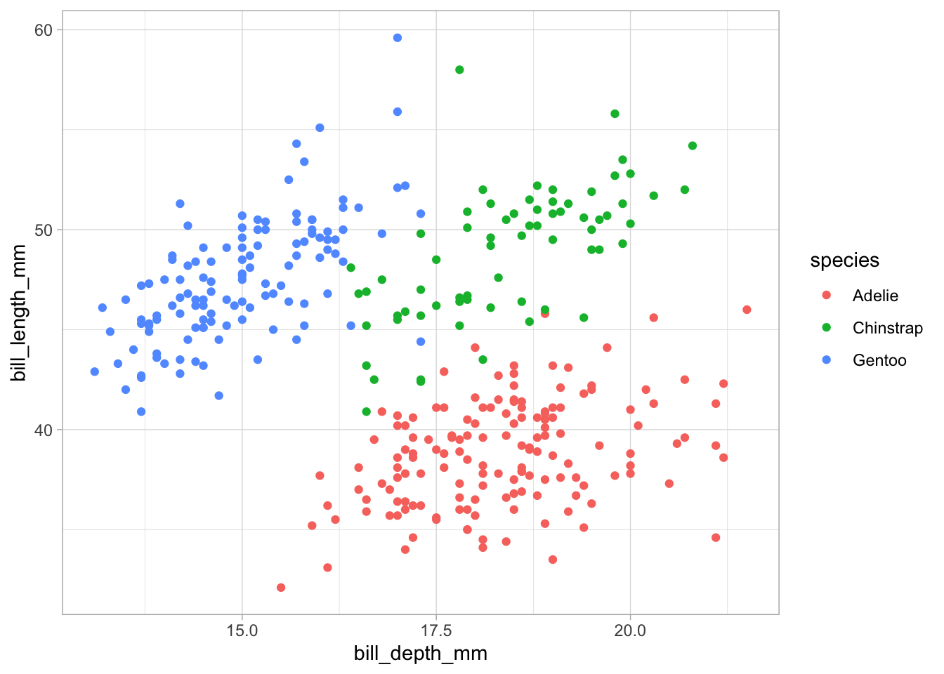
This is looking good but we can do better. Lets update the axis titles and give our graph a title.
Axis labels and titles
example_plot <- ggplot(data = penguins,
                       aes(x = bill_depth_mm,
                           y = bill_length_mm)) +
  geom_point(aes(color = species)) +
  theme_light() +
  labs(x = "Bill Depth (mm)",
       y = "Bill Length (mm)",
       title = "Penguin Bill Depth Compared to Bill Length")

example_plot
Warning: Removed 2 rows containing missing values (geom_point).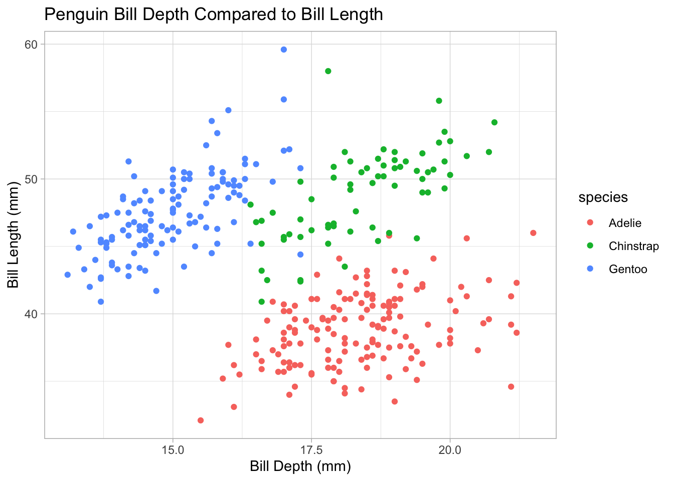
Citation
BibTeX citation:
@online{french2022,
  author = {Jessica French},
  title = {Basic Ggplot2 {Example}},
  date = {2022-12-21},
  url = {https://jessicafrench.github.io/code_examples/2022-12-21-ggplot-example},
  langid = {en}
}
For attribution, please cite this work as:
Jessica French. 2022. “Basic Ggplot2 Example.” December 21,
2022. https://jessicafrench.github.io/code_examples/2022-12-21-ggplot-example.